1. Height
Height What it does The Height control determines the height of the main slider. Example 560px Increase the value when you want a larger visual gallery. Decrease the value when you need a more compact slider. Recommended usage Large gallery: 500–700px Standard website section: 400–600px Compact gallery: 250–400px
Slider Mode allows you to choose how the gallery navigation works.
2. Slider Mode
Normal Mode
Creates a traditional slider without thumbnail navigation.
Use this when you want a simple, clean carousel experience.
Thumbnail Mode
Displays the main slider together with thumbnail navigation.
Use this when users need to preview and quickly navigate between multiple slides.
The Direction setting controls the orientation of the slider.
3. Direction
Horizontal
Slides move from left to right or right to left. This is the recommended option for most websites.
Vertical
Slides move vertically. This can be useful for unique layouts, dashboards, galleries, and creative websites.
4. Effect
The Effect setting controls how one slide transitions into another. Use the available effect options to create different visual experiences.
Slide
The standard sliding animation.
5. Slides
The Slides control is where you add and manage your gallery content. Each slide can contain supported media.
Your component supports multiple media types, including examples shown in your panel such as:
Image
Media Type — Select Image as the slide content.
Image — Upload or select the image displayed in the slide.
Title — Add a title or caption for the image.
Show Title — Show or hide the image title.
Position — Choose where the title appears on the image.
Offset — Adjust the title's distance from its selected position.
Offset X — Fine-tune the title horizontally.
Offset Y — Fine-tune the title vertically.
Font Family — Select the font used for the title.
Font Size — Adjust the title text size.
Weight — Set the title font weight.
Text Color — Choose the title text color.
Video
The Video slide supports both Vimeo and uploaded video files.
Media Type — Select Video as the slide content.
Source Type — Choose between Vimeo and an uploaded video source.
Video URL — Add the Vimeo video URL when using Vimeo.
Video File — Upload your video when using the upload option.
Thumb Image — Add a custom thumbnail displayed before the video plays.
Autoplay — Automatically start video playback when enabled.
Loop — Continuously repeat the video.
Muted — Start the video without sound.
Controls — Show or hide the video player's controls.
Play Icon Size — Adjust the size of the play button.
Icon Color — Customize the play icon color.
Icon BG — Set the play button background color.
Icon Radius — Adjust the play button's corner radius.
Lottie
The Lottie slide allows you to display animated Lottie content inside the slider.
Media Type — Select Lottie as the slide content.
Lottie Source — Choose the source type for the Lottie animation.
Lottie URL — Add the URL of your Lottie animation.
Thumb Image — Add a thumbnail image for the Lottie slide.
Autoplay — Automatically play the animation.
Loop — Repeat the animation continuously.
Speed — Control the Lottie animation playback speed.
Lottie Fit — Choose how the animation fits inside the slide.
Lottie BG — Set the background color behind the animation.
Title — Add an optional title or caption.
Show Title — Show or hide the title.
Position — Choose where the title appears.
GIF
The GIF slide allows you to display animated GIF content.
Media Type — Select GIF as the slide content.
GIF URL — Add the URL of the GIF you want to display.
Title — Add an optional title or caption.
Show Title — Show or hide the title.
Position — Choose where the title appears.
Offset — Adjust the title's distance from its selected position.
Offset X — Fine-tune the title horizontally.
Offset Y — Fine-tune the title vertically.
Font Family — Select the title font.
Font Size — Adjust the title size.
Weight — Set the title font weight.
Text Color — Customize the title color.
6. Per View
Per View controls how many slides are visible at the same time.
Example: 1
Displays one slide at a time.
Example : 2
Displays two slides.
Example : 3
Displays three slides.
7. Slide Gap
The Slide Gap controls the spacing between visible slides.
Example : 10px
Creates a 10px gap between slides.
Increase the value for a more spacious layout.
Decrease the value for a tighter gallery.
8. Slide Radius
The Slide Radius controls the corner radius of the slide media.
Example
20px
Use:
0px → sharp corners
12px → subtle rounding
20px → modern rounded design
30px+ → highly rounded design
Match the radius with the rest of your website.
9. Infinite Loop
The Infinite Loop
setting allows the slider to continuously cycle through the slides.
Yes
After reaching the final slide, the slider continues from the beginning.
No
The slider stops when it reaches the end.
10. Autoplay
The Autoplay setting automatically changes slides.
Enable
The slider automatically moves through your content.
Disable
Visitors manually control the slider.
11. Speed
The Speed setting controls the slider transition timing.
Your panel currently shows a speed value such as 0.3s.
12. Object Fit
The Object Fit setting controls how media fits inside the slider.
Cover
The media fills the available area while maintaining its aspect ratio.
Some parts of the image may be cropped.
Contain
The entire media remains visible.
There may be empty space around the media.
12. Inner Padding
Inner Padding controls the spacing inside the slider area.
Use this to create breathing room between the slider content and its container.
13. Thumbnails
Thumbnail settings are available when using Thumbnail Slider Mode.
The Thumbnail panel includes:
Per View — Set how many thumbnails are displayed at once.
Gap — Adjust the spacing between thumbnails.
Radius — Control the corner radius of thumbnail images.
Tray Gap — Set the distance between the main slider and thumbnail tray.
Active Style — Customize the visual appearance of the currently selected thumbnail.
14. Arrow
The Arrows panel provides detailed controls for navigation arrows.
Available settings include:
Show Arrows — Show or hide the previous and next navigation buttons.
Layout — Choose how the navigation arrows are arranged.
Placement — Set the position of the arrow group around the slider.
Group Gap — Control the spacing between grouped navigation arrows.
Offset — Fine-tune the arrow position from its placement edge.
Size — Adjust the overall size of the arrow buttons.
Radius — Customize the corner radius of the arrow buttons.
Background — Set the default arrow button background color.
Hover Background — Set the background color when hovering over an arrow.
Hover Scale — Add a scaling effect when hovering over the arrows.
Icon Color — Customize the color of the arrow icons.
Custom Icon — Replace the default arrow icon with your own custom icon.
15. Dots
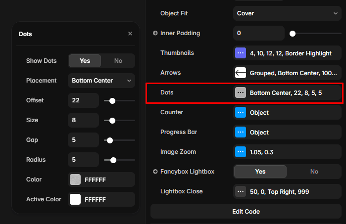
The Dots panel provides detailed pagination controls.
Available settings include:
Show Dots — Show or hide pagination dots.
Placement — Choose where the pagination dots appear.
Offset — Adjust the distance of the dots from their placement edge.
Size — Set the size of each pagination dot.
Gap — Control the spacing between dots.
Radius — Adjust the corner radius of the dots.
Color — Set the default dot color.
Active Color — Set the color of the active slide indicator.
16. Counter
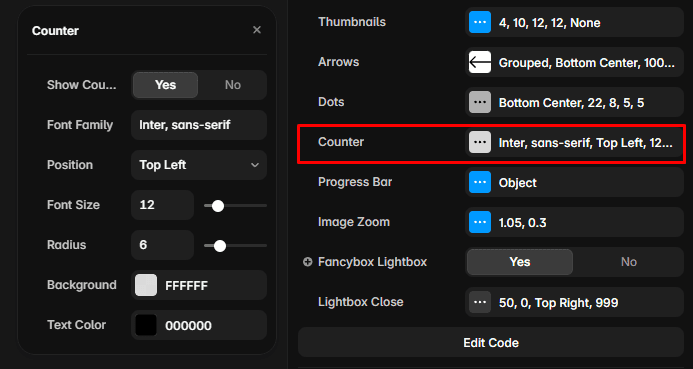
The Counter displays the current slide position.
For example:
01 / 05
This tells visitors they are viewing the first slide out of five.
Show Counter — Display or hide the current slide counter.
Font Family — Choose the font used for the counter.
Position — Set where the counter appears on the slider.
Font Size — Adjust the counter text size.
Radius — Customize the counter container's corner radius.
Background — Set the counter background color.
Text Color — Set the counter text color.
17. Progress Bar
The Progress Bar panel provides a visual indication of the current slide position.
Available settings include:
Show Bar — Show or hide the progress indicator.
Position — Choose where the progress bar appears.
Height — Adjust the thickness of the progress bar.
Offset — Control the distance from the selected position.
Radius — Customize the progress bar's corner radius.
Track Color — Set the background track color.
Fill Color — Set the active progress color.
18. Image Zoom
Hover Zoom — Enable or disable image zoom when hovering over the media.
Scale — Control how much the image enlarges on hover.
Duration — Adjust the speed of the zoom animation.
19. Fancybox Lightbox
Enable or disable the expanded lightbox experience for viewing media.
20. Lightbox Close
Show Button — Show or hide the lightbox close button.
Size — Adjust the size of the close button.
Inset — Control the distance between the close button and the lightbox edge.
Position — Choose where the close button appears.
Background — Set the close button background color.
Icon Color — Customize the close icon color.
Radius — Adjust the close button corner radius.
Backdrop — Enable or disable the background overlay behind the lightbox.